
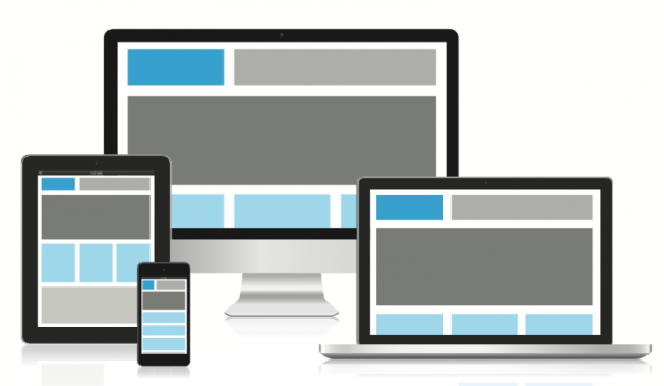
As technology is becoming increasingly mobile, ease of use on all devices such tablets, laptops and smartphones is very important. Both terms have been used to describe how effectively users can access a website on a mobile device. It describes the visual aesthetics of the website on other devices and how a visitor can easily navigate the website.
If a user is not impressed by the visual design of the site on their mobile device and they cannot access the information they need, they may find another alternative. But what do both terms mean and what are the benefits of each?
Responsive design
The term ‘Responsive Web Design’ was coined by web designer, Ethan Macrotte for his 2010 tech blog, “A list apart”. He described how the technique for extensions of progressive enhancement for mobile in an efficient and practical way- meaning, media inquiries and conditional CSS can be used to create flexible and fluid layouts for any screen. Confused? To put it simply, it means how the browser size adapts to the size of the mobile device.
The screen size, images and text can be repositioned accordingly depending on the size of the screen to create a more appealing look to enhance user experience. An example of a responsive website design can be seen in the ‘Visit London’ website which is excellent for visitors who are looking up information on their mobiles.
Adaptive design
Adaptive is similar to responsive in the respect that it adjusts the content on the screen to fit the user’s device, but instead of the content repositioned, the designers use a series of templates that are based on different breakpoints of the pages pixel width on a given device. When the screen reaches a certain pixel width, it will automatically adjust to the next static template until the screen width shrinks to the next breakpoint.
Another difference with adaptive web design is the streamlined layered approach which creates a faster loading time on the device.
Which one is better?
Responsive is considered more efficient than adaptive, as it can optimise the look of the website to fit any screen and responds to nearly every change. The content will be presented on screen as an easy to take in and understandable format. However, this does make mean that adaptive design is any less of an efficient design. Adaptive designs will not respond until they are loaded, this means that the website is detecting what is using and can optimise the site to fit the screen.
This ensures that the website being viewed has been properly selected to fit the specific device.
In conclusion, it is important to that you adapt your website content to fit the range of mobile devices that are available. As technology continues to advance, there may be more options on the way, so it is vital to be prepared for any new piece of technology.
If a user cannot properly access the content they need from your site, they lose interest within seconds. Design specialists can give helpful and professional advice on how to properly adapt your website for the varied devices on the market and they can work with you to ensure that your site will look professional.
By Harry Price
Harry Price is a talented young writer from a small costal village in the south of england. He lives with his 3 dogs and enjoys taking them on long costal walks.